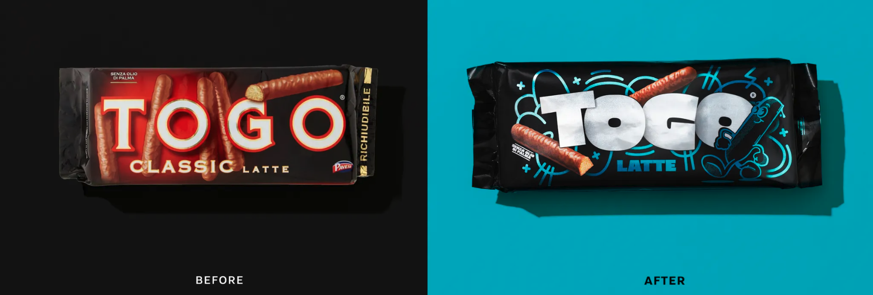
Italian cookie brand Togo, once a household name known for its seductive 90s advertisements, has undergone a remarkable transformation. Recognizing the need to adapt to modern tastes and aesthetics, Togo enlisted the expertise of Italian design agency Marimo for a comprehensive redesign. This overhaul, recently celebrated with Dieline’s prestigious 2024 Redesign of The Year award, marks a pivotal moment for the brand as it bridges its cherished heritage with a contemporary visual identity.
Departing from its previous emphasis on a premium aesthetic, the new Togo packaging boasts a bold and dynamic look, featuring a graffiti-inspired backdrop in vibrant hues. This striking visual update, coupled with a thicker and more prominent logo, ensures Togo stands out both on shelves and across digital platforms, catering to a new generation of consumers while staying true to its roots.
Anna Di Cintio, Creative Director at Marimo, explains that the goal was to redefine what it means for Togo to be "sexy" in today's cultural landscape, emphasizing the importance of entertainment and surprise. Central to this rebranding effort is a cookie-inspired cartoon mascot, injecting playfulness and relatability into the brand's persona across various touchpoints.
Noteworthy is the strategic decision to minimize product photography on the new packaging, opting instead to convey the mood and experience of enjoying Togo cookies. This shift reflects the evolving nature of branding in an increasingly digital world, where packaging must resonate both on shelves and on screens, fostering brand virality and visibility.
Overall, Marimo's award-winning redesign successfully honors Togo's rich history while propelling it into the digital age, creating a visual identity that resonates with modern consumers. By striking a balance between tradition and innovation, Togo's revamped brand image ensures its continued relevance and connection with audiences worldwide.


