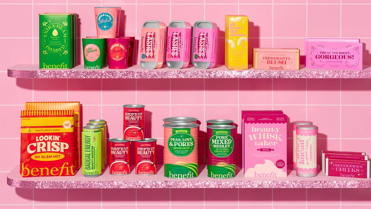
Benefit Cosmetics has cooked up a delightful new packaging range for its Benemart Holiday pop-up shop. A delightfully retro twist on classic pantry items, the playful packaging is a unique twist on cosmetics branding, bringing a welcome dose of colour and creativity to the shelves.
Recent packaging designs typically opt for a more minimalist look, diluting the cosmetics design sphere with a sea of uninspired, stripped-back design. Embracing bright and characterful packaging, Benefit stands out among the crowd as a brand that's unafraid to challenge convention and bend the rules of cosmetics branding for the better.
With items packaged like tinned fish, energy drinks, tomato soup and even bars of chocolate, the designs each have a unique flair that expertly blends classic 50s-style food packaging with a stylish contemporary look. Benefit has always been known for its retro packaging, and while food-inspired cosmetics were quite the trend in the early 2010s with the likes of Too Faced's Chocolate Bar palette and themed makeup brands like Beauty Bakerie, benefit's resurgence of the style feels fresh thanks to its clever copy and authentic design.
It seems like retro packaging could be having a comeback after chef Matty Matheson launched his classy food packaging for Matheson Food Company earlier this year. We're slowly seeing the packaging world edge its way back into playful design (check out Milk & More and Tomatier for some prime examples) and with Gen Z's increasing interest in candid marketing and anti-design, I predict there's plenty more to come in the upcoming weeks.


