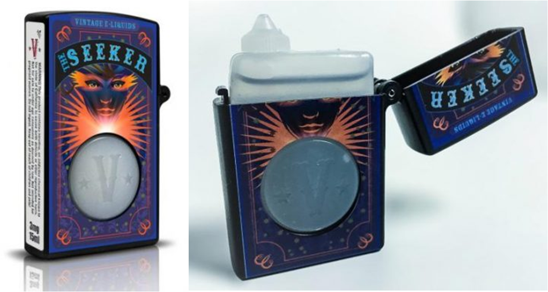
Many e-cigarette users, especially younger ones, view e-cigs as a lifestyle accessory. Some brand owners are therefore using packaging design (both graphic and structural) to position their e-cig brands as stylish, chic or elegant. Vintage E-Liquids’ One Flick dispenser, for example, is designed with the look and feel of a refillable pocket lighter from the “Mad Men” era. The Vintage e-liquid dispensers also are decorated with intriguing graphics—and the packaging is now child-resistant. The One Flick combines a rigid outer case with a plastic insert that holds e-liquid. To open the package, the consumer pushes the back of the hinged lid forward to bypass a latch, while at the same time lifting the front of the lid. An instructional label on the back of each case shows how to open the child-resistant package, which launched in early 2016. Flipping open the case’s lid reveals the dispenser tip of the insert. For controlled dispensing of e-liquid drops, the consumer presses on the insert through a circular opening in the front of the case. The package comes in two sizes: 15 ml and 35 ml. Graphics are identical for both sizes. In regards to the label it uses two-ply label. It include as much information as possible to comply with both current and upcoming State, Federal and International regulations. Since we had a limited amount of real estate on the bottle, the two-ply/catalogue label route was chosen. This label also helps to seal the bottle and serves as somewhat of a “tamper resistant” feature. The label is typically peeled off in its entirety to open the bottle, which is why we have the perforation at the bottom. Once the label is removed, one can still see what nicotine level of the bottle.


