Coke’s new “One-Brand” marketing strategy is officially making its way to store shelves and beverage coolers, starting in Mexico.
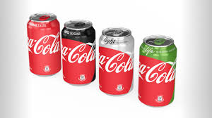
Executives unveiled a series of new graphics, which put a contemporary spin on a classic icon by prominently featuring the Coca-Cola Red Disc on bottles and cans of all four Trademark Coke brands – Coca-Cola, Coke Zero, Diet Coke/Coca-Cola Light and Coca-Cola Life – tonight at an event in Mexico City.
“Packaging is our most visible and valuable asset,” said Chief Marketing Officer Marcos de Quinto, who presented the new packaging within the context of the “One-Brand” strategy and supporting “Taste the Feeling” creative campaign. “By applying the Coca-Cola Red Disc to our packaging in such a bold way, we are taking the next step towards full adoption of the ‘One-Brand’ strategy, uniting the Coca-Cola family under one visual identity and making it even easier for consumers to choose their Coca-Cola with or without calories, with or without caffeine.”
The new designs will help consumers make informed choices, de Quinto explained, by identifying each Coca-Cola product with its signature color – black for Coke Zero, silver for Coca-Cola Light/Diet Coke and green for Coca-Cola Life – and including the product’s unique name and benefits.
The new packaging will be available in Mexico the first week of May. Like the staggered rollout of the “Taste the Feeling” campaign, similar versions of the Red Disc graphics will reach additional countries throughout 2016 and into 2017. In North America, Coca-Cola is exploring a variety of “One-Brand” packaging graphics, but will not make any changes to Trademark Coke packaging this year due to an already packed marketing and promotional calendar.
“The unification of the brands through design marks the first time in our 130-year history that the iconic Coca-Cola visual identity has been shared across products in such a prominent way,” said James Sommerville, Coke’s VP of global design. “When applied across packaging, retail, equipment and experiential, this new approach becomes a global design language that utilizes a historical brand icon to present the range of Coca-Cola products available today in a contemporary and simple way.” Read a Q&A with Sommerville about the new designs.
First introduced in the 1930s on hand-painted Coca-Cola advertising, the Red Disc has become synonymous with great taste, uplift and refreshment. A contemporary version was introduced earlier this year as the visual centerpiece of the “Taste the Feeling” campaign. The integrated campaign also includes TV, print, outdoor and digital media, a visual identity system (VIS) and a global music anthem.


