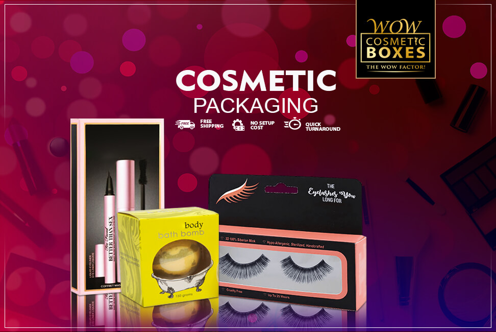
When it comes to the packaging design trends, the year 2021 has been crazy. We have seen some crazy trends and design ideas for the Cosmetic Packaging solution. But this year has come to an end, and it is time to welcome 2022. Now is the time to ask yourself if your cosmetic business is ready for this year and the ones to come? In the last year, we have realized the importance of e-commerce more than ever. But we have to admit that online platforms can never replace the charm of a retail store and its branding values. There is a dire need to change our packaging solution according to the changing design trends. Adapting the existing features to the new trends can go a long way in building a strong brand image. Here is the list of the exclusive trends that will dominate in the year 2022.
Use Natural and Earthy Tones for the Cosmetic Packaging
For the past few years, the minimalism trend is on the rise, and it will continue to be on the top in 2022 and coming years. It is best to choose shades that are natural and earthy when choosing a design that is pure and simple. Natural colors always make customers feel good. In the coming years, there is more focus on the natural elements. Using shades like off-white, light green, pink, and subtle blue will help to build a strong brand identity. The cosmetic industry is the most suitable market to adopt this trend. You can take inspiration from others. You can choose from many creative designs to create your unique solution.
The Feeling of Touch Evokes the Emotions
Have you ever considered the importance of the feeling of the touch? It is something that evokes positive emotions in the customers. Think of the moment when you touch a natural thing, you are automatically thrilled with calm and peaceful emotions. Holding something old and rustic will fill you up with nostalgic feelings. Working on the textured is essential as it is the part of our subconscious mind. Humans crave emotional connection, and touch is powerful in generating emotions. The texture can enhance the product's emotional appeal, and that's why more and more brands aim for textured packaging solutions.
Use the Modern Illustration to Communicate With Customers
One of our favorite trends for cosmetic boxes is the use of bold and modern illustrations. Graphics and illustration patterns are the best way to communicate your brand images and bring out the visual appeal of your product. Illustrations should be relevant to inside content and help build a personal connection with customers. In 2022, we will be seeing the cosmetic industry filled with illustrated design with a touch of modernism and boldness. The idea behind using illustrations is to increase customer engagement and make the experience more enjoyable for them. Playing with bold patterns is the way to stand out.
Be Creative to tell your Story
We know how we love to listen out stories, and storytelling is an ideal way to communicate your story with the targeted audience. There is no other art that helps you to connect with the customers beautifully than storytelling. People love to connect with the businesses that are offering more than a simple item. 80% of purchase decisions are driven by emotions. It means that if your packaging solution fails to tell an engaging story, you are missing an opportunity to target the audience. Creating a stronger relationship with the customers is all it needs a creative design and storytelling.
Add a Little Transparent Window to Display Packaging
40% of the customers are willing to purchase a product that is transparent to the customers. People love to get a product that has honesty and authenticity. Nobody wants to get scammed, and it mostly happens in retail stores. A plastic window on top of custom Display Packaging makes it an ideal way to showcase your items. Most customers wish to see the product in actuality before making the purchase. But it is not possible in cosmetic stores. So how can you overcome this problem? Adding a little transparency will help to enhance the visual appeal.
Experiment with the Typography and Fonts
The more clear and readable your design will be, the more it will increase the customer’s ease and convenience. Most customers are preferring convenience over other factors to make the purchase. That's why it is essential to choose fonts that are appealing and easy to read. In addition to using the brand logo, make sure to include the brand and product name. The name should be visible and legible. Clear typography can create a unique brand presence in the crowd. The reason behind choosing the right fonts makes it easy to read the information from the distance.


