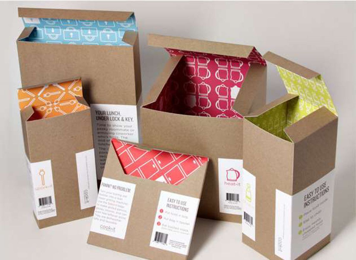
Our brains and eyes are accustomed to looking at attractive colors. We always see different colors around us. They could be natural or artificial but their appeal is always strong. There are some interesting facts about colors unearthed by science in recent years. It is interesting to consider that pink was once considered a masculine color while blue was taken as the feminine shade. But our attitudes towards colors have changed sharply in recent years and that has impacted how they are used today.
While there are so many other things that a company has to focus on but still colors should never be taken for granted. Successful brands are always trying to incorporate trendy colors and this helps them in keeping the market share they already have. They spend a lot of money on market research focused on the utility of different colors for different age groups. There is always a strong thinking process that precedes the application of different colors n packaging. Checking successful brands makes it clear that they use colors that instantly impress anyone with their grace and charm. Every company should put in the required effort to get the desired results and achieve success in the crowded market.
Understanding the Audience
Before selecting any color scheme the audience must be taken into account and studied properly. Investigating the behaviors and preferences of consumers reveals a lot of important details that can be useful for selecting colors.
These investigations can be done using different criteria. For instance, some companies like to target consumers according to their ages. Their research is specifically focused on different demographic sections and the results are used in this way too. Focusing on different ages means trying to cater to the needs of young people and older people differently. It is a common observation that youth likes punchy colors that are lively and engaging. While middle-aged and older people prefer colors that have a nostalgic touch to them and invoke memories. This strategy has proved to be a successful one.
Another way to evaluate consumers and trends is to look at different localities. Different areas have unique tastes. So, when sending orders, companies can use packaging that is welcomed in a particular area.
Contrast
It is unwise to talk about color and not mention contrast. Just applying colors on retail packaging boxes is never enough. Creating the perfect contrast between different colors and turning them into various shades is the real deal that a lot of brands do not usually accomplish. But those who do reap the benefits of it.
Creating a contrast between two or more colors can help amplify the appearance of all the colors. If only one color is used, the box looks similar from every angle and becomes unappealing. But if different colors are used and a perfect contrast is created, variations are generated that make a container look more beautiful.
Color Palette
This is an idea based on transition. Gradients have become trendy and are being used by a lot of brands in their packaging. While contrast makes two colors stand separate from each other, gradient designs make a smooth transition from one color to the next.
It is a bend of different colors, usually more than two, that are interconnected uniquely. They are not mixed but rather blended in a way that creates an amalgam that is pleasing to look at.
Their versatility makes them such a perfect choice for companies. They are suitable for combining different colors and making a mixture out of them. They also have the flexibility to change the punchiness of colors. To pronounce one color more, others can be faded to create a focal point. Some designs are flat, so to make them more pronounced, gradients can be used. They add depth to the overall appearance and make it beautiful.
Choosing the right colors is the most important aspect of making a gradient look attractive. Numerous gradients are made by several people but not every gradient is beautiful. The color theory should be used while selecting the shades. Some techniques can be useful here. The first one uses different shades of the same color. For instance, while using read, one could use two or three shades going from darker to lighter tone or vice versa.
Another strategy involves the color wheel. Complimentary colors are those that are opposite to each other on the color wheel. They go together well. Or, if three colors are to be used, they should have equal spacing between them to create the perfect triad.
Moods can also be affected by them. If calmness is desired, a transition from green to blue will do the trick. If a punch of energy and revitalization is required, bold colors like orange and red will accomplish the job.


