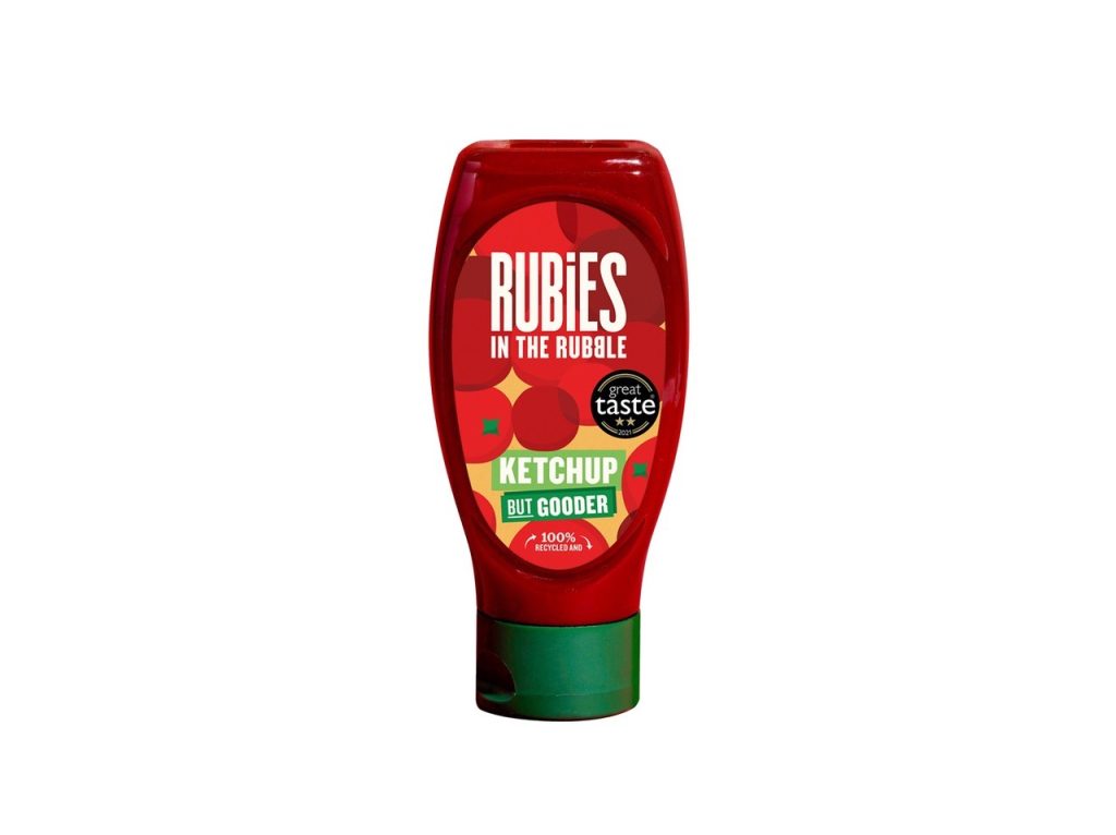
Creative agency Hell Yeah! has created a new look squeezy bottle for sustainable condiment brand Rubies in the Rubble’s flagship ketchup product.
The redesign, which is on shelf now, aims to premiumise the brand, enhance taste appeal and stand out in an incredibly competitive category.
Rubies in the Rubble produces delicious ketchups, mayos and relishes using surplus cosmetically imperfect ingredients, which would otherwise have gone to waste.
The redesign moves away from the traditional white label seen across the category to celebrate the imperfections of the fruit, which are shown joyfully squeezed together within the new design. The illustrations inject a more graphic and playful feel that aims to create greater presence on-shelf within a homogenous category. The Rubies ‘gem’ shape motif is hidden within the design, with the bottle’s green lid suggesting a tomato stem.
Rubies strapline ‘‘Ketchup, but Gooder’ is at the base of the label, appealing to parents by reinforcing the brand’s positioning that there is a better way to do things (not only is Rubies made from surplus fruit and veg, but it uses recycled plastic bottles and contains half the sugar of most other brands).
The redesign has launched nationwide in more than 900 stores.


