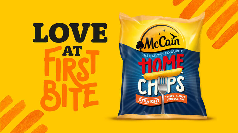
McCain partnered with BrandOpus, a global brand design agency, to execute the new McCain look and feel, further strengthening the brands consistency and memorability.
From Home Chips to Croquettes, Smiles to Crispy French Fries, the packs feature the updated McCain identity, a bespoke typeface and hand printed brand assets. Following the global redesign for the brand back in 2013 with BrandOpus, this is the latest development in the partnership to strengthen the McCain brand and herald the new look and feel across all touch-points. BrandOpus designed the packaging to ensure that the McCain brand is connected and memorable wherever it is seen, be that on shelf or in campaigns.
The new visual identity and brand world feature a simplified and strengthened logo, which builds on BrandOpus’ previous identity system for McCain, that saw the frozen food producer reach phenomenal long-term growth. The new identity prepares the business for further growth amidst a changing market landscape.
Wider details of the new packaging artwork:
- Identity – the latest evolution of the sunshine identity is a simplified, strengthened, more iconic execution of the brand, featuring front and centre on all SKU’s.
- Bespoke typeface & accompanying fonts – the type style captures the natural brightness & reflects the diversity of the product portfolio. Bespoke font “McCain Wedgebrush” which is handmade and expressive, while two supporting fonts “Rooney” and “Brother”, are used to communicate the finer details of each product.
- Hand printed assets – hand printed assets/illustrations have been created using real potatoes to convey the natural and real ingredients used in McCain products.


