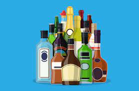
The study – published in the Journal for Studies on Alcohol and Drugs – also found that packaging helps shape perceptions of the product, drinker and drinking experience.
Led by Daniel Jones, of the Institute for Social Marketing and Health (ISMH) at Stirling, the research addresses a gap in knowledge – with previous studies having typically focused on traditional and digital alcohol marketing, rather than packaging itself.
The findings provide pause for thought about the contrast between unrestricted designs in alcohol packaging, and the plain packaging legal requirements for cigarettes. Further research should consider potential benefits of stronger regulation of alcohol packaging and labelling, as well as public support for such changes, the researchers say.
The new study – which was supported by Alcohol Focus Scotland – sought to explore how young adults, aged between 18 and 35, viewed and engaged with alcohol packaging. Fifty current drinkers, from Scotland, participated in eight focus groups in which they were shown, allowed to handle, and asked about a range of alcoholic products.
“We found that, for young adult drinkers in Scotland, alcohol packaging can capture attention, create appeal, and help shape perceptions of the product, drinker and drinking experience,” Mr Jones said. “Five main themes emerged from our data: the ubiquity of alcohol packaging; its appeal and ability to catch attention; its association with particular occasions and activities; its ability to inform perceptions; and its engagement of both visual and non-visual senses – taste, touch, sound and smell.”
Participants discussed seeing alcohol packaging in different settings – typically shops and drinking venues – and via marketing, particularly advertising. They frequently recalled seeing it featured in the media – with most reporting exposure on television, in movies, on social media and the internet.
Most recalled packs that stood out in shops were considered appealing for being different, interesting, or aesthetically pleasing. Notably, some participants reported purchasing alcohol products solely on pack appeal, with one saying: “I don’t actually like beer, but I bought it specifically because I liked the packaging.”
Packaging design – such as colours and graphics – is central to appeal, as is structure, with most participants drawn to sleek or distinctive shapes. Size of packs was also said to be important, for example, larger packs were considered more cost-effective and preferable when intending to consume a large quantity of alcohol. Smaller ‘grab and go’ packs were thought to enable and encourage consumption in public settings, such as on trains or at concerts, and help avoid unwanted attention from police and security. One participant said: “I think it would be easier to hide that you were drinking.”
On-pack promotions – such as gifts and prizes – contributed to appeal, as did sponsorships, for example those linked to sports, festivals, and television shows. Meanwhile, most felt that price marks on packaging were indicative of inferior products. Limited edition packs were considered eye-catching and seen as an incentive by several participants, thought to encourage trial, collection, and upcycling – with most having retained expensive or “cool” empty bottles for display or collection.
All groups frequently associated packaging with specific occasions and activities – such as Smirnoff and Gordon’s for socialising and nights out; Budweiser for watching football at home and at parties; and Strongbow and Blossom Hill for festivals, outdoor drinking, or drinking before going out.
Most participants were clear about who was being targeted by the packaging and which products were appropriate for different ages and genders. Several used pack appearance as an indicator for taste and palatability – expecting certain drinks to be fruity, light, or refreshing due to the design of the packaging.


