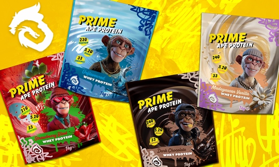
Working within a time-frame of just six days, the agency created the range with a dynamic visual theme, fusing rich stylised background graphics with flashes of graffiti art. Each variant incorporates a uniquely distinctive ape character that has been intricately rendered as the mascot for the specific protein flavour.
Packaging artwork for the Prime Ape Protein product range is tailored for implementation across a fully printed, flexible film stand-up pouch format that is set up to run on an automated powder filling line.
Phil Parkinson, owner of Who Dares Design, said “We had a 360 degrees overview of the project, driving the entire creative process, artwork development and related technical strands such as the generation of pack cutter guides for designs to be built into, ensuring that speed-to-market was increased and our client could proceed with their pre-allocated product manufacturing and packaging production slots, enabling them to launch efficiently and cost effectively”.