In today's crowded marketplace, a product's packaging is more than just a pretty box. It's a silent salesperson, vying for customer attention on crowded shelves and influencing purchasing decisions in a split second. Let's delve into two case studies where strategic packaging redesigns led to a significant boost in sales and brand perception.
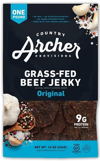
Case Study 1: Country Archer Provisions - Jerky with a Modern Twist

The Packaging Redesign: Country Archer embarked on a packaging overhaul, focusing on three key elements:
1. Bold Branding: A new, simplified logo with clean lines increased brand recognition.
2. Mouthwatering Photography: Close-up, high-quality photos of the jerky showcased the product's texture and flavors, enticing customers.
3. Clear Navigation: Color-coded packaging blocks differentiated flavors, making it easier for consumers to find their preferences.
The Result: The redesigned packaging was a success! Sales increased by a whopping 28% within just 26 weeks of launch, nearly doubling the brand's previous growth rate. Brand awareness also soared, thanks to the more eye-catching design.
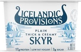
Case Study 2: Icelandic Provisions - Skyr Gets a Viking Makeover

Icelandic Provisions, aiming to expand its market share for its premium Skyr yogurt, needed to stand out in a sea of white yogurt tubs. Their existing packaging, while clean, lacked personality and didn't convey the unique qualities of Skyr.
The Packaging Redesign: Icelandic Provisions took a bold approach, completely revamping their packaging.
The new design incorporated:
1. A Playful Logo: A Viking longboat logo instilled a sense of Icelandic heritage and adventure.
2. Vibrant Colors: The use of bright, contrasting colors made the product pop on store shelves and grabbed attention.
3. Clear Communication: The packaging highlighted the product's protein content and thick, creamy texture.
The Result: The new Viking-inspired packaging was a hit! Sales increased by 16% within six months of launch, compared to the previous year. Distribution also expanded significantly, as retailers were drawn to the eye-catching design.
Key Takeaways:
These case studies illustrate the power of strategic packaging redesigns. By understanding your target audience and focusing on clear communication, visual appeal, and brand storytelling, you can transform your product's presence on the shelf and achieve remarkable sales growth.
Packaging is an investment, not an expense. A well-designed package can be the difference between getting lost in the crowd and becoming a customer favorite.


