

New Packaging Designs are necessary to revamp your product and to make your product stand out among many products. Customers always look for sweetness and light in their everyday product, Mischievous characters that make you smile, serene colorways, and harking back to simpler times by way of nostalgic design trends; these are just a few of the themes that are beginning to play out in 2022’s packaging design trends.
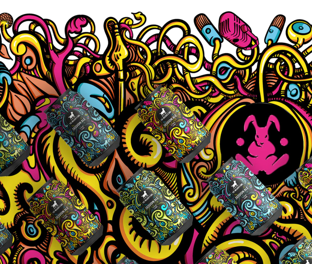 The New Era of 60's Psychedelia Some design trends are so sacred that they never slink out of style, and 1960s psychedelia definitely falls under that category. The contemporary take on the resurgence of ’60s psychedelia reminds us of a time of free love, peace, and happiness which we can’t deny we need more of as we head into the deeper waters of the pandemic. Distorted typefaces, ‘groovy’ waves, and pop colors set against contemporary products help these ’60s inspired packaging designs stand out and leave us with a feeling of peace and love, man.
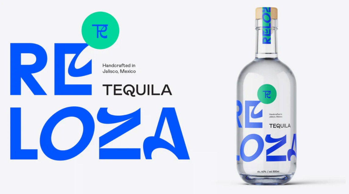 Eccentric Text Centric Designing Sometimes people forget that type of design is an intricate art form in its own right, which is celebrated in this current trend for text taking center stage as a form of standalone art. All signs of photography and illustration are set aside to make room for standout typefaces, often using contrasting colors to give the design a boost of energy. This trend challenges everyday perspectives of fonts, where the font is seen as a piece of art over prioritizing readability.
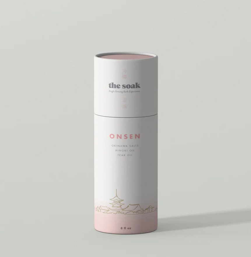 Finding Serenity in Packaging 2022 continues to be a turbulent time in the world, which makes the packaging design trend of finding serenity perfectly timed and just the calm we need in our homes right now. Muted and complementary colors give us that initial sigh of relief, whilst simplistic copy and minimal typefaces make for unfussy readability. The popularity for calming phenomenon ASMR even finds itself translating into packaging design, where shiny smooth or deliberately textured packaging surfaces add another dimension of serenity in packaging.
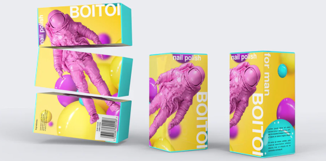 Faux 3D Deco This innovative faux 3D graphic illustration brings a sophisticated and contemporary edge to this packaging design trend. Playing with depth and illusion is a sure-fire way to get consumers to stop and look, almost literally jumping out at you demanding your attention. As faux 3D is such a technical effect to create, it shows the consumer that you’re at the forefront of trends and technology, which basically translates into ‘this product is worth the money—it’s an ideal design idea for tech products on the more expensive end of the spectrum.
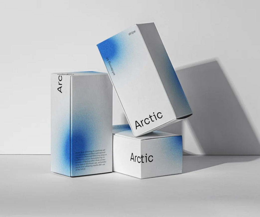 Mesmerizing Color Mist Plain white packaging is given an injection of life with sprayed misted color pops. The trend for color mists has taken over the Instagram design world, possibly because of its calming effect which stops you in your tracks mid-scroll. This design effect is so mesmerizing and enigmatic that it’s hard to place how a designer might create this effect, however a mix of over-blurring and adding noise to a color pop on Photoshop might just do the trick.
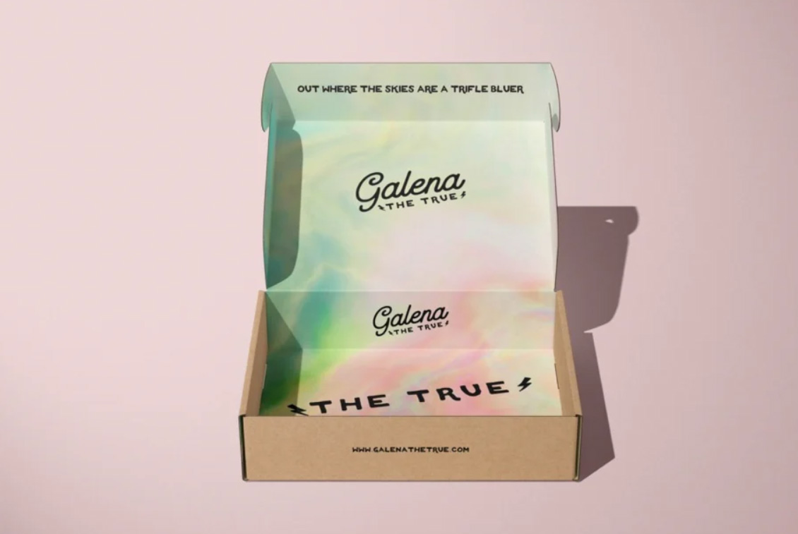 Minimal Inside, Maximal Inside You know a jacket is special when its lining is just as beautiful as the outer shell? Well, the same can be said for packaging design. What a treat it is when you open up your minimalistic packaging to reveal a maximalist and beautifully crafted interior. Simplistic and minimal logos are carried through from the outside-in, to reveal bright colors and maximalist illustrations, leaving consumers delighted and with your brand top of mind.
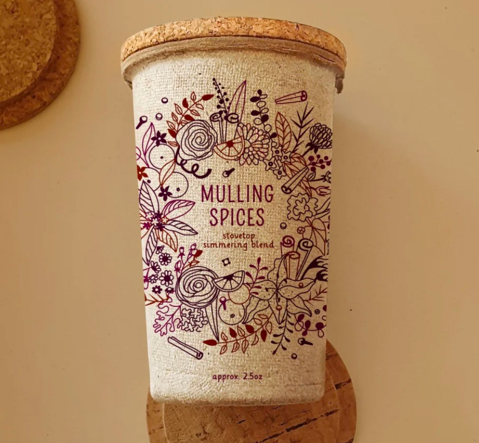 Perfectly Imperfect Raw Materials Earthy imperfect textures remind consumers where brands are getting their materials from, a must for brands that want to push their eco-friendly ethos and tap into the consciousness of consumers’ concerns with the climate crisis (excuse the tongue twister). As the industry is rapidly changing to favor brands with sustainability at the core of their offering, ethical and compostable packaging is one of the many things you can do as a brand to show you’re serious about your sustainable positioning. Off-white, recycled textured materials also provide a beautiful backdrop for printed ink, creating a delicate distortion of color.
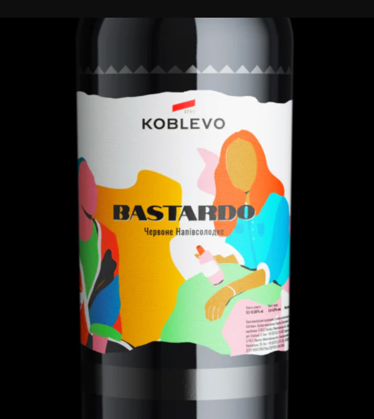 Cut 'n' Paste Color Layering The love for collage lives on as an integral form of design, this year with more of a focus on geometry and the layering of colors. The ripped raw edges of paper give a nod to recyclable materials which is handy for tapping into the eco-conscious market. Where college is still very much on-trend in the independent scene, using collage in your packaging design allows you to connect to that specific high-earning creative audience.
- The Y2K Aesthetic The Y2K aesthetic was huge between the mid-1990s and 2005 where people were obsessed with technology and the millennium, characterized by a ’90s take on cyberpunk. The Y2K trend is fascinating as it is commonly seen as a baffling (albeit charming) blip in the fashion and design world. But as all trends recycle themselves after 20 years, just like clockwork the early millennium trend is back with vengeance. The beauty of the Y2K resurgence is the charming irony where in the early millennium we were obsessed with futurism, now this old view of futurism is nostalgic, in a similar vein to retro-futurism. Pale blues, silvers, white and pale neons set the backdrop, whilst geometric shapes add a dynamic edge.
- The reign of rubber hose characters Just WHO are these jaunty guys strolling their way all over our packaging? Rubber hose characters were made famous in the 1920s USA thanks to creators like Bill Nolan and Walt Disney, and have been modernized in recent years by illustrators all over the world with elevated brush strokes and more sarcastic and playful expressions. Their friendly demeanors instantly make you smile, which is the ultimate goal of packaging design, right? Compared to the original rubber hose characters of the 1920s, you can often find the 2022’s variety in caps, sneakers, and tattoos, which visually brings the aesthetic into the contemporary.
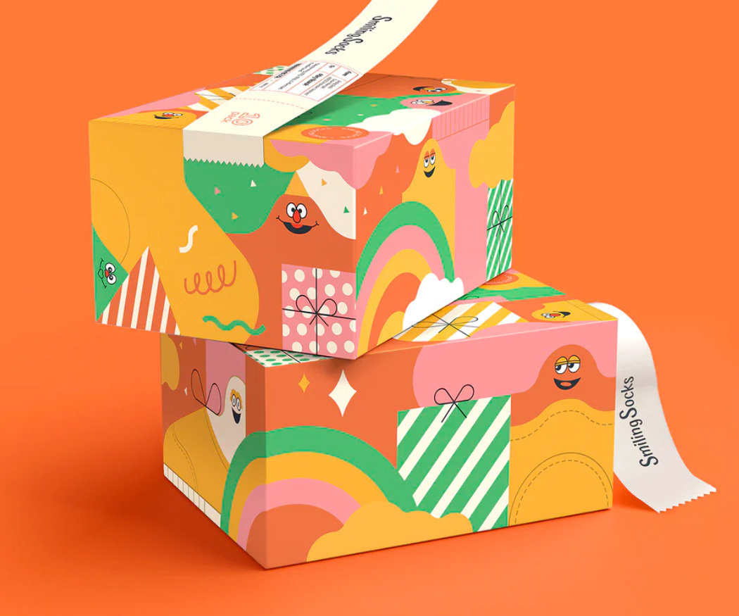 Mischief Illustrated The mischievous illustration trend gives a knowing nod to its viewer with its ironic childlike drawings and teeters on the edge of meme culture with its satirical style. As with the rubber hose characters, these youthful drawings leave you smiling, if not a bit puzzled how they’ve made their way onto your packaging. After all, humor is one of the quickest ways into someone’s heart.
Serene colorways, charming characters, and nostalgia; if there’s anything we can learn about 2022’s packaging design trends it’s that consumers are looking for positive vibes.
Post category


