As detailed in the previous blog, structural design can make or break the shelf presence as well as long-term branding image of a product. Let’s look at a few success-stories in the niche that is structural packaging design and how it correlates to a product’s sale.
1. NuCalgon
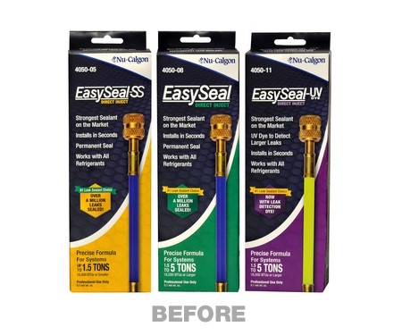
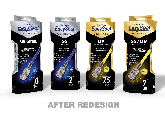
Nu-Calgon is an American company that markets and distributes a line of specialty chemical and associated products for the HVACR aftermarket. For rebranding one of their products, they decided to adopt a packaging style that screamed “premium”. The beveled box structure differentiates the brand from others in standard cuboidal wraps on the rack. In addition to the bevels, the upright structure is indented in the middle that aids easier gripping. The look is accentuated using metallic stock and inks and is contrasted and contoured by a black base.
In addition to the changes made to the colours, inks and outer structure, language and placement of key information was also improved. Different colours are used to differentiate between various product models and primary and secondary title placement is also adjusted.
2. ChitoRhino’s Clean Wash
The Clean Wash case study shows that a customer or consumer’s interaction with the packaging of a product does not end at the point of sale. Rather, once the sale is made, the ease of unboxing, repacking (if required) and repeated use determine the average retention rate of customers.
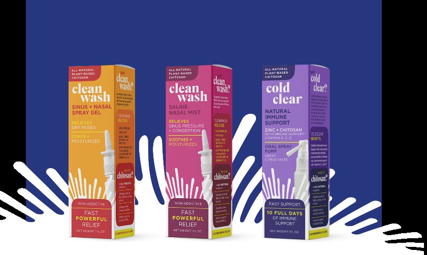
Clean Wash, provides all-natural ear, nose, and throat products using chitosan. Overcrowded health and wellness shelf space meant they really needed to come up with something out-of-the-box to match up to and hopefully beat their competitors.
They decided to use the story behind their conceptualization to unite multiple SKUs. A brightly coloured palette was used along with a simple identifiable mark. An increase of 300% was reported in their total sales after upgrading the packaging.
To solidify their commitment to their new design choices, the team also initiated a novel advertising campaign with a fresh product photoshoot. This campaign also highlighted the new features added and advanced technology changes made to the product itself besides the packaging.
Dave’s Sweet Tooth
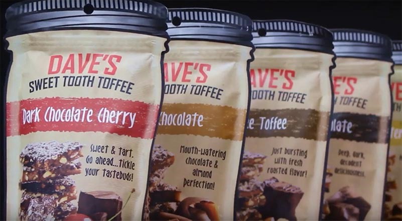
Another success story is that of Dave’s Sweet Tooth. To boost sales during their transition from online to retail sales, they considered a packaging design that would prove to be a game changer. The traditional look of screw cap jars was used in die-cut pouch format. The iconic “mason jar” look is their USP and their brand identifier.
They printed full color on a white stock that allowed the use of full color photography and branding elements.
Wisconsin Hemp Scientific
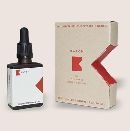
The locally-sourced cannabis brand created a secondary packaging design shaped into the letter “B” represents their BATCH brand logo.


