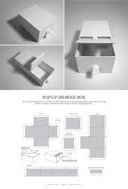
It is repeatedly emphasized that packaging serves multiple purposes; not only does it protect the contents during transportation and for long term storage, it also acts as a canvas for creating the brand image and prominently placing the symbols that one’s customers may associate with the product for a long period of time.
For retail products in particular, the packaging and its design can be the difference between a sale and the lack of. It is thus not surprising when we see companies repeatedly investing to upgrade their packaging by studying the market and needs of their customers.
Many different elements and aspects come into play when it comes to enhancing the impact of the packaging and its design. These include colors, symbols such as logos and mascots and also the shape of the packaging itself.
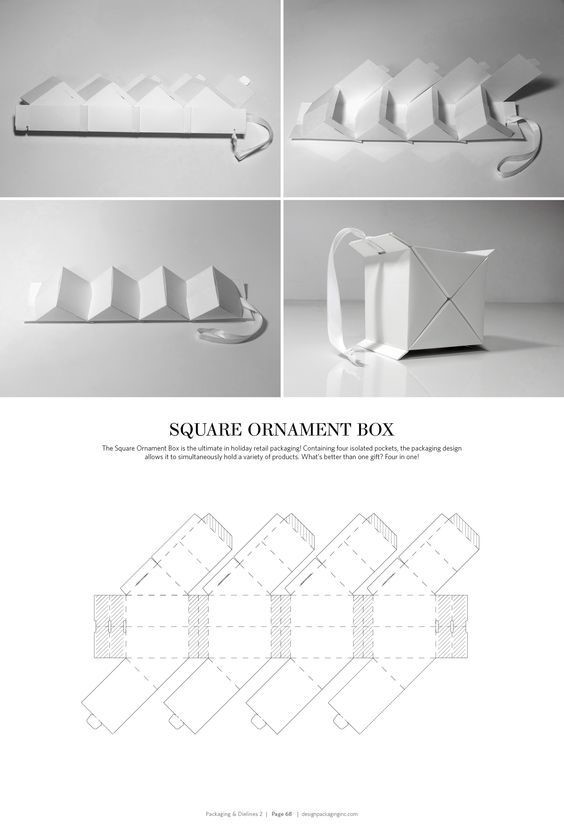
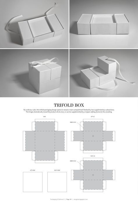
Structural design lends it capabilities to the form and functionalities of the packaging. Unlike creative design that tests different colors, words and images to promote engagement, structural design is the outlet used to support the creative elements while keeping ease and efficiency of handling in mind. Structural design can also be used to help the product and packaging stand out; by using eye-catching geometric structures and/or functional systems and aids that competitors do not.
Increasing the functionality of the packaging, especially primary packaging, can exponentially increase the chances of a purchase. For products of regular and repeated consumption through packaging, such a toothpaste tubes, milk boxes etc., consumer experience is extensively impacted by the functionality of the packaging. This, in turn, affects the retention rate of customers and builds customer loyalty.
The experience factor is not only associated with convenience of use but also the aesthetic pleasure associated with unboxing.
Read about a few crowd-favorite structural packaging design success stories in our next blog.


