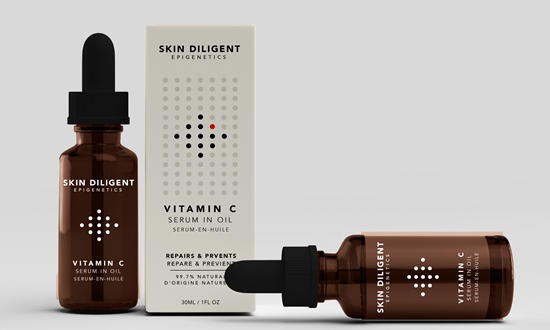
The brief was for a new design to showcase its focus on efficacy, improving skin health at a cellular level.
Skin Diligent’s new logo aims to reflect the clean, quiet luxury of the brand, featuring uppercase font which alongside the simple black and white shades, creates impact in its simplicity. It is accompanied by ‘epigenetics’, to permanently marry the name of the brand with the category, reflecting its ownership of the space.
Each product features a ‘dot cell matrix’, whereby the dots themselves become a distinctive, ownable visual language to tell the story of each product.
The cells therefore become as central to the design as they are to the efficacious skincare of Skin Diligent, visualising the brand’s dedication to science, echoing chemical formulas and genetic mapping.
For each product, a single colour is added to one of the dots within the individual matrix of said product.
Nick Vaus, co-founder & managing partner at Free The Birds, said: “In a crowded market, brands from luxury to masstige level are continuously innovating to bring new ingredients and formulations to a highly discerning audience. We sought to inject a dose of Beautiful Thinking into Skin Diligent’s brand and its products, supporting the business in securing its leading status in the epigenetic space and achieving differentiation in design which does justice to its innovation.”
Tule Park, Co-founder at Skin Diligent, added: “We feel confident that our new branding and the design of our packaging, devised by the team at Free The Birds, truly helps to achieve this. I’m very grateful for the care and diligence with which they approached our work together.”


