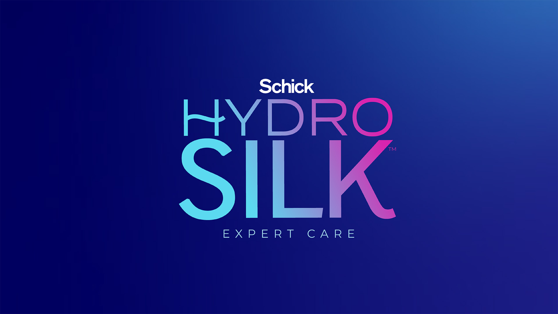
“The revitalized Hydro Silk brand identity boldly reinforces our positioning focused on providing our consumers with the power to achieve expert level hair removal results at home,” said Melissa Murphy, Director Brand Strategy at Hydro Silk. “Through this comprehensive and cohesive brand identity system, we aspire to elevate our brand expression in a relevant and premium way, effectively communicating our brand’s commitment to unwavering standards of quality, performance, and results.”
JDO seized the opportunity to revolutionize the Hydro Silk brand, not only by uniting the portfolio with a clear and streamlined design but also by sharpening its positioning to balance its care credentials with an elevated expertise. Isabelle Aleksander, Senior Strategist at JDO, elaborates, “Our goal was to create the belief that consumers no longer need to settle for average hair removal results; Hydro Silk provides the expertise, high performance, and caring touch they seek, empowering them to achieve professional quality results in the comfort of their homes. ‘Expert Care’ now serves as a brand qualifier and is placed under the logo across all touchpoints, promising precision and performance whilst putting the consumer in control of their hair removal experience, from head to toe.”
Hydro Silk’s revamped identity channels the sophistication of salon prestige with an editorial vibe that reflects the high performance and quality the brand delivers. The new logo not only pays homage to the brand’s established heritage in self-care but also propels it forward with confidence, clarity, and credibility. With a captivating gradient, the new mark possesses a modern vibrancy that is both distinctive and eye-catching, especially on packaging, where it commands attention, ensuring a compelling presence on the shelf.
The master brand colour has been updated to a sleek dark blue with a subtle gradient, giving Hydro Silk a premium, professional look while also honouring the brand’s roots in hydration and facilitating effective brand blocking. A new typeface has been introduced to further emphasise Hydro Silk’s superior expertise, while the hair removal products are prominently showcased to highlight their remarkable level of quality.
“By highlighting the product’s exceptional performance and maintaining a bold, uncluttered aesthetic, the new identity and packaging underscore Hydro Silk’s commitment to championing the thoughtful routines and choices that help individuals be at their best without ever compromising their high standards,” comments – Ben Oates, Creative Director and Founder at JDO.
“As we began to work with JDO, it became abundantly clear that Hydro Silk could undergo a powerful transformation, evolving into the premium, professional-grade brand that modern beauty consumers seek, all while retaining the care and warmth that our trusted consumers value,” comments – Murphy. “JDO’s work achieves this delicate balance beautifully and boldly. Their strategic expertise and creative passion were instrumental in driving this project forward, empowering us with the courage to make big changes. This is the identity of an iconic category leader, and that is precisely what Hydro Silk aims to be.”


