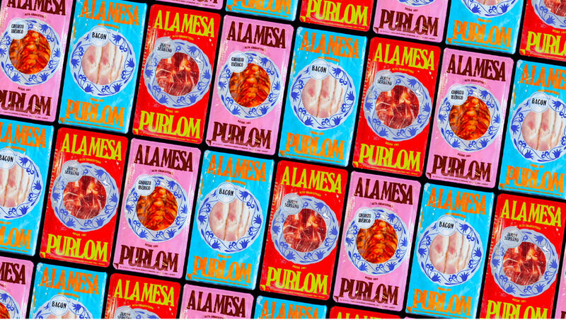
Bold typography, lively colors, and graphics that nods to the brand's history came together to reimagine Purlom's new look as immersive and playful while maintaining the same family-owned feel.
In addition, a blue and white frame was added around the product, creating a visual treat. Even the boxes got a makeover with bright colors and bold writing. Onmi's work not only catapults Purlom into the modern market but also aligns with the brand's core values: fostering meaningful memories around the dinner table.
Trend Themes
1. Visual Branding Refresh - The re-imagined packaging for Purlom represents a trend of visually refreshing established brands to appeal to a younger demographic, while maintaining the brand's heritage.
2. Immersive Packaging Experience - Purlom's new packaging design showcases a trend of creating an immersive and playful experience through bold typography, lively colors, and graphics that nod to the brand's history.
3. Meaningful Packaging Design - The addition of a blue and white frame around the product highlights the trend of incorporating visually appealing design elements to create a meaningful and visually appealing packaging experience.
Industry Implications
1. Food Packaging - The vibrant and visually refreshing packaging for Purlom represents an opportunity for innovation within the food packaging industry, enticing a younger audience while staying true to brand heritage.
2. Brand Identity - Onmi Design's reimagined visual branding for Purlom presents an opportunity for disruptive innovation in the brand identity industry, catering to younger customers and showcasing a brand's heritage.
3. Graphic Design - The lively colors, bold typography, and historical references in Purlom's packaging redesign offer a space for disruptive innovation in the graphic design industry, creating immersive and visually appealing brand experiences.


