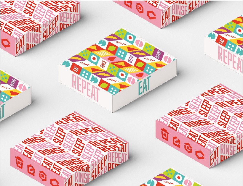
For the initiative create concept, White Bear explored what comes to mind when people think of recycling. The universally known recycling symbol inspired the studio to transform the product itself into its own recognisable symbol, with the logo conveying the brand’s purpose before the package is opened.
The bright colour palette and street inspired typography appeals to the brand’s time poor, Millennial and Gen Z demographic. To generate chatter across digital and turn their heads White Bear played with language like ‘Don’t recycle’ and with the campaign strapline ‘Eat, rinse, sleep.’ The strapline tells customers how to use the product but also aims to ring with nostalgia from the days of the rave culture.
In a similar repetitive style, the identity includes a pattern inspired by simple food shapes to be used across the brand world, which can also be customasible to the fast food chain it will appear in.


