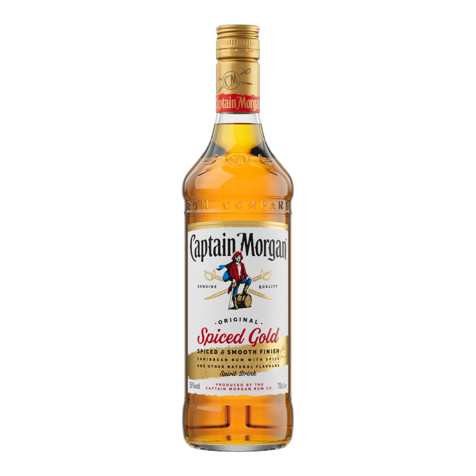
The new design builds on the Spice On campaign which celebrates the spice of Captain Morgan’s liquid and ‘spice’ as the individuality people bring to social situations. The new pack puts the quality, flavour and most importantly the spice of the liquid at the forefront of the design.
The design features a bold colour palette and the addition of a dynamic and expressive gold brush stroke that reflects the golden spice and smoothness of the drink.
The new pack also includes a refreshed version of the brand’s famous Captain icon, maintaining recognizability while allowing the liquid to shine through as the hero – reinforcing the brand’s enduring smooth and delicious taste amid an explosion of flavour innovations within the spirits category over recent years.
The brand appointed creative agency Bulletproof to design the new pack.
Jo Smith, Global design lead for Captain Morgan, said: “We wanted to create a fresher, more dynamic design that puts taste and flavour at the forefront. On our journey towards Captain Morgan’s new global brand world, we enlisted the help of creative agency Bulletproof, who captured the essence of the brand with the final pack we see today.”
Tony Connor, Executive Creative Director at Bulletproof, said: “Our design plays on what people love most about Captain Morgan – its versatility and deliciousness. We developed new brand assets and an architecture that has the opportunity for more liquid storytelling, while anchoring in the strong equity the brand has built over time. We’ve given the brand the freedom and flexibility to show up in bold and exciting ways, bringing spice to new occasions and consumers.’


