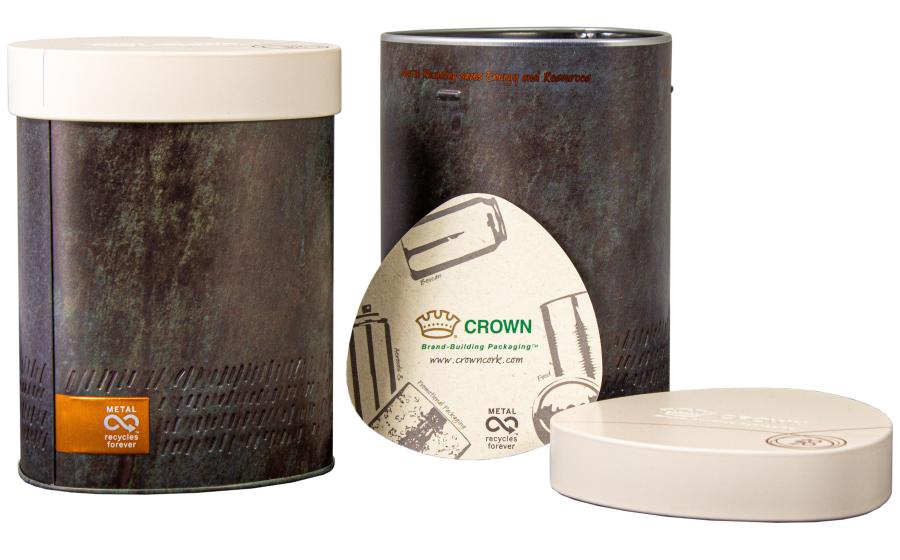
The first outcome of the trends analysis is a new promotional package (or gifting tin) that captures the “Human Nature” trend. Time slows down in what Perryman refers to as an authentic trend, focusing on the beauty of difference within the environmental landscape, where people are mindful of nature and respectful of the natural flow of its processes. The concept tin has been designed to embody that spirit and appeal to the next generation of eco-conscious consumers seeking to purchase goods that take greater care of the environment. The gifting tin’s inks create an oxidized mineral effect, giving the appearance of natural weathering over time and draws on a color palette that embraces the diversity of nature. Debossing effects have been added to the lower section of the package’s body, lending a hand-carved appearance linking back to the raw tactility aspect of the Human Nature trend. The contrasting lid - designed to look like stone and featuring a matt texture - demonstrates how metal can support opaque designs. The package’s triangular construction and rounded edges provide a high level of differentiation on-shelf, making it a perfect match for the gifting market. In addition to its eye-catching design, the tin is easier to grip – a direct result of Crown’s designers taking ergonomics into account on every project they undertake. Sarah D’Amato, NPD and Marketing Manager at Crown Aerosols & Promotional Packaging, commented: “It has been a truly interesting exercise to conceptualize this unique tin based on our recent color trends research project. The tin is a great example of how we can leverage our extensive research to create tangible products, ensuring brand owners have the tools they need to appeal to specific demographics. This particular project focused on the “Human Nature” trend, and we look forward to launching other concept packages based on our research and continuing to advance our portfolio for the benefit of our customers.”


