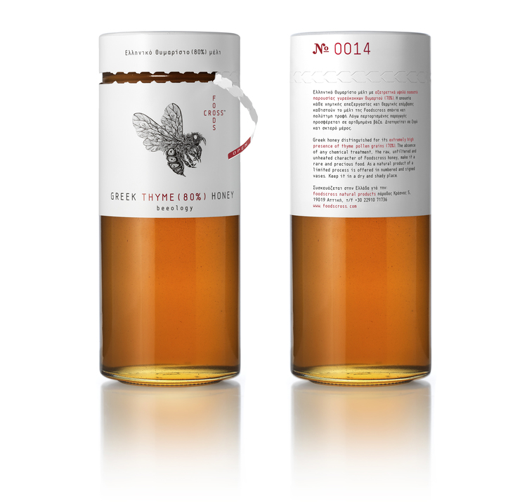
As the market of honey is increasing and alot of established brands with variety of packaging exist, So the idea behind this packaging design is to attain brand differentiation which will also be able to convey its specific advantage i.e. its pure synthesis.
This logo design used a careful pairing of cross-shaped lettering (brand name) and the image of a bee, designed by the internationally known illustrator Si Scott. The elongated glass vessel is covered on its upper part and toped by the brand identity elements and relevant information, in a way that allows the synthesis specifics and the collector’s data (number) to be clearly visible even when the top is removed. Black, white and red dominate the packaging design in an alternative reference to a pharmaceutical/cosmetics language.


