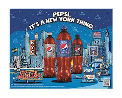
The work is designed to create a visual love letter to NYC, which Pepsi is very much a part of, both in the literal sense, as its headquarters are based there, but also symbolically.
“Pepsi and NYC both live boldly and unapologetically, in the most refreshingly authentic way,” says Deborah Lynne Kugler, PepsiCo Beverages North America senior design manager.
“At a time when New York is coming out of a pandemic that affected it in quite a deep and visual way, we wanted to remind locals of the slice of NYC life that they know and love. We are highlighting those everyday sights filled with color and personality, the things that showcase NYC’s uniqueness, source of delight and strength,” she adds.
The work captures three scenes of the city from different points of view- overlooking the Brooklyn Bridge during the day, early morning Central Park and night time in Times Square- with the aim of blending the most lovable aspects of NYC with the playfulness of the Pepsi brand.
The final goal of the project was to zone in on NYC with Pepsi standing alongside the local landmarks, as life moves in and around it, Kulger explains. The typography was recreated by hand, to further enhance the concept that Pepsi is a ‘New York Thing.’
The colour palette is anchored in Pepi’s blue, in addition to the red and white colours the make up the brand identity, all of which is highlighted with warm colours.


