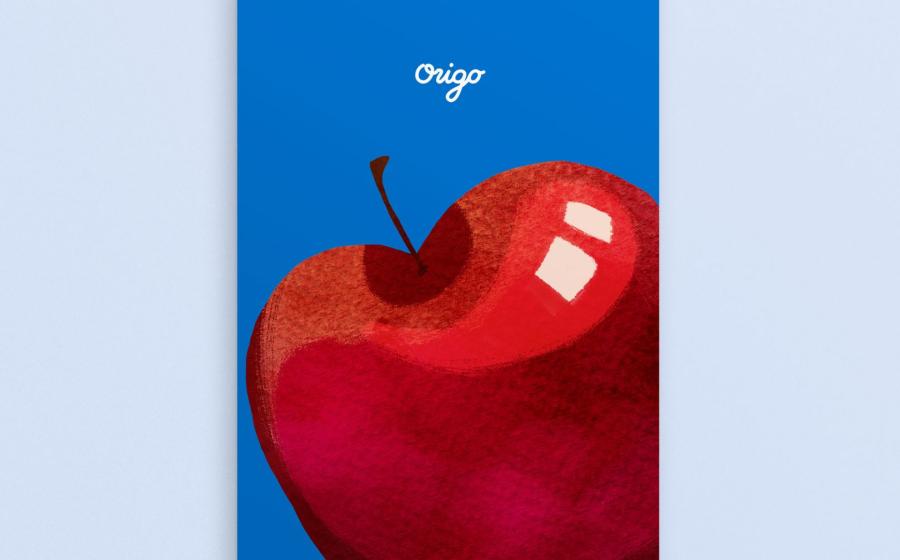
Now he's created the identity and packaging for Origo Foods, a new business venture from a young husband and wife team that sells freeze-dried fruits to parents and children, made with 100% real ingredients and zero additives.
Origo uses super-low temperatures, up to -50°C to remove water, but lets the fruits retain most of their nutrition, shape, and natural colour. Once it has been dried, the fruit tastes crunchy and can be stored at room temperature. As such, Andrew chose an "approachable" direction that would appeal to the target audience.
He chose bold colour combinations to ensure that the packaging is eye-catching and unique. Illustrations were drawn a little imperfect to create a "cute but non-child-like look". In accompanying photography, products were styled like little creatures on plates and bowls to encourage mixing Origo products with other food and snacks.
"My style tends to lean towards the minimalist side aesthetically," Andrew tells us. "However, I always try to design to what the project needs. I think it is important to ensure that the direction captures the main audience. So, I tend to shift my design styles accordingly."
The underlying theme for any of Andrew's projects is practicality. "In packaging design, pricing of the individual packaging is always a big hurdle. For this reason, my design is forced to be practical. And what I try to do is to make sure that this practicality has some sort of beauty to it."

